Luspatercept in beta-thalassemia (Chen 2021)
Source:vignettes/articles/Chen_2021_luspatercept.Rmd
Chen_2021_luspatercept.RmdModel and source
- Citation: Chen N, Kassir N, Laadem A, Giuseppi AC, Shetty J, Maxwell SE, Sriraman P, Ritland S, Linde PG, Budda B, Reynolds JG, Zhou S, Palmisano M. Population Pharmacokinetics and Exposure-Response Relationship of Luspatercept, an Erythroid Maturation Agent, in Anemic Patients With beta-Thalassemia. J Clin Pharmacol. 2021;61(1):52-63. doi:10.1002/jcph.1696. PMCID: PMC7754485.
- Article: J Clin Pharmacol. 2021;61(1):52-63 (open access, PMC7754485)
Chen 2021 reports a population PK model of subcutaneous luspatercept in adults with beta-thalassemia, followed by exposure-response analyses that use the model’s individual apparent clearance to derive each patient’s exposure. The paper contributes five models to nlmixr2lib:
| Model | Endpoint | Source |
|---|---|---|
Chen_2021_luspatercept |
Serum luspatercept concentration (one-compartment PK) | Table 2; Results equations |
Chen_2021_luspatercept_hb_change |
Average hemoglobin change from baseline, weeks 1-3 (linear) | Figure 2A |
Chen_2021_luspatercept_hb_response |
Probability of a >= 1 g/dL day-21 hemoglobin increase (logistic) | Figure 2B |
Chen_2021_luspatercept_teae_grade3 |
Probability of a grade >= 3 TEAE in cycles 1-2 (logistic) | Figure 4A |
Chen_2021_luspatercept_bone_pain |
Probability of bone pain of any grade in cycles 1-2 (logistic) | Figure 4B |
The four exposure-response models have no PK layer: each takes the
starting-dose steady-state AUC over the 21-day dosing interval as the
covariate column AUC_LUSP (ug*day/mL). Chen 2021 computed
that AUC as starting dose / individual CL/F, which is what this vignette
does with the PK model.
Population
The PK population comprised 285 adults with beta-thalassemia: 64 from the phase 2 dose-finding/expansion study A536-04 (NCT01749540; continued in the extension A536-06) and 221 from the phase 3 BELIEVE study ACE-536-B-THAL-001 (NCT02604433). From Chen 2021 Table 1: median age 32 years (18-66), median weight 57.1 kg (34.1-97.0), 56.8% female, 63.5% White and 28.8% Asian, median baseline albumin 46.0 g/L (30.0-56.0), median baseline RBC transfusion burden 14.1 units/24 weeks (0-34.0), 59.6% splenectomised, and 86.0% with normal renal function. Luspatercept was given subcutaneously once every 3 weeks at 0.2-1.25 mg/kg; 79.8% of patients started at 1 mg/kg and 34% escalated to 1.25 mg/kg during the first year. The analysis used 3680 quantifiable serum concentrations collected 5-610 days after the first dose.
Source trace
| Quantity | Value | Source |
|---|---|---|
| Structure: 1-compartment, first-order absorption and elimination | – | Results, ‘Luspatercept Population PK Model’ |
| CL/F | 0.532 L/day | Table 2 |
| V1/F | 8.39 L | Table 2 |
| Ka | 0.409 1/day | Table 2 |
| CL/F covariate equation | 0.532 x (WT/70)^0.806 x (ALB/46)^-0.881 x exp(-0.0118 x [RBCT - 14]) | Results equation |
| V1/F covariate equation | 8.39 x (WT/70)^0.705 x exp(-0.0141 x [RBCT - 14]) | Results equation |
| IIV CL/F, V1/F | 34.7%, 27.6% (exponential) | Table 2; Methods |
| Residual error | 20.8% (additive on log-transformed data) | Table 2; Methods |
| Hb change: slope | 0.011 g/dL per ug*day/mL (R = 0.72) | Figure 2A panel annotation |
| Hb change: intercept | -0.327 g/dL | Digitized from the Figure 2A fitted line |
| Hb change: residual SD | 0.511 g/dL | OLS refit of the digitized Figure 2A points |
| Hb >= 1 g/dL: slope | log(3.73)/50 = 0.02633 per ug*day/mL | Figure 2B OR per 50 units of AUCss |
| Hb >= 1 g/dL: intercept | -3.593 | Digitized from the Figure 2B fitted curve |
| TEAE >= grade 3, cycles 1-2: intercept, slope | -2.360, -0.0001916 per ug*day/mL | Digitized from the Figure 4A fitted line |
| Bone pain, cycles 1-2: intercept, slope | -1.144, -0.002191 per ug*day/mL | Digitized from the Figure 4B fitted line |
How the figure-derived coefficients were obtained
The figures in the published PDF are vector graphics, so the fitted lines, the scatter points and the axis tick marks are stored as exact coordinates rather than pixels. The maintainers extracted those coordinates, mapped each axis by linear regression on its tick marks, and read the coefficients from the mapped lines. No curve was fitted by eye. The chunk below repeats the arithmetic from the extracted coordinates (PDF points, y increasing downward) so that it can be audited.
axis_map <- function(tick_pos, tick_val) {
  fit <- stats::lm(tick_val ~ tick_pos)
  function(pos) unname(stats::coef(fit)[1] + stats::coef(fit)[2] * pos)
}

# Figure 2A (page 7): x ticks 0-200, y ticks -2 to 3.
x2a <- axis_map(c(80.74, 124.64, 168.845, 212.755, 256.225), seq(0, 200, 50))
y2a <- axis_map(c(187.475, 166.345, 145.415, 124.565, 103.38, 82.375), -2:3)
line2a <- data.frame(auc = x2a(c(94.13, 267.33)), d_hb = y2a(c(147.925, 104.115)))
slope2a_drawn <- diff(line2a$d_hb) / diff(line2a$auc)
mid2a <- colMeans(line2a)
int2a <- unname(mid2a["d_hb"] - 0.011 * mid2a["auc"])

# Figure 2B (page 7): x ticks 0-200, y ticks 0-1. Three on-curve Bezier nodes.
x2b <- axis_map(c(328.155, 372.06, 416.27, 460.175, 503.645), seq(0, 200, 50))
y2b <- axis_map(c(187.475, 166.345, 145.415, 124.565, 103.38, 82.375), seq(0, 1, 0.2))
node2b <- data.frame(auc = x2b(c(341.325, 434.83, 514.275)), p = y2b(c(183.315, 145.235, 95.515)))
slope2b <- log(3.73) / 50
int2b <- stats::qlogis(node2b$p[2]) - slope2b * node2b$auc[2]
free2b <- stats::coef(stats::lm(stats::qlogis(p) ~ auc, node2b))

# Figures 4A and 4B (page 9): x ticks 0-300, y ticks 0-1; two line end nodes.
x4 <- axis_map(c(89.67, 111.49, 133.34, 155.285, 176.96, 199.12, 220.52), seq(0, 300, 50))
two_point_logit <- function(xp, yp, ytick) {
  y4 <- axis_map(ytick, seq(0, 1, 0.2))
  auc <- x4(xp)
  lg <- stats::qlogis(y4(yp))
  slope <- diff(lg) / diff(auc)
  c(intercept = lg[1] - slope * auc[1], slope = slope)
}
c4a <- two_point_logit(c(95.49, 221.05), c(185.045, 185.505),
                       c(194.22, 172.75, 151.095, 129.2, 107.81, 85.57))
c4b <- two_point_logit(c(95.49, 221.055), c(346.46, 356.75),
                       c(371.935, 350.465, 328.81, 306.915, 285.52, 263.28))

digit <- tibble::tribble(
  ~Coefficient,                          ~Derived,        ~`In model`,
  "Fig 2A slope of drawn line",          slope2a_drawn,   0.011,
  "Fig 2A intercept (printed slope)",    int2a,           -0.327,
  "Fig 2B intercept (printed OR slope)", int2b,           -3.593,
  "Fig 2B free-fit slope (3 nodes)",     free2b[[2]],     0.02633,
  "Fig 4A intercept",                    c4a[["intercept"]], -2.360,
  "Fig 4A slope",                        c4a[["slope"]],  -0.0001916,
  "Fig 4B intercept",                    c4b[["intercept"]], -1.144,
  "Fig 4B slope",                        c4b[["slope"]],  -0.002191
)
knitr::kable(digit, digits = 5)| Coefficient | Derived | In model |
|---|---|---|
| Fig 2A slope of drawn line | 0.01057 | 0.01100 |
| Fig 2A intercept (printed slope) | -0.32748 | -0.32700 |
| Fig 2B intercept (printed OR slope) | -3.59327 | -3.59300 |
| Fig 2B free-fit slope (3 nodes) | 0.02613 | 0.02633 |
| Fig 4A intercept | -2.35976 | -2.36000 |
| Fig 4A slope | -0.00019 | -0.00019 |
| Fig 4B intercept | -1.14438 | -1.14400 |
| Fig 4B slope | -0.00219 | -0.00219 |
stopifnot(
  # The printed values that the drawn lines must agree with.
  abs(slope2a_drawn - 0.011) < 0.0006,        # printed to 2 significant figures
  abs(free2b[[2]] / slope2b - 1) < 0.02,      # printed OR 3.73 per 50 units
  # The packaged coefficients are the derived ones, rounded.
  abs(int2a - (-0.327)) < 5e-4, abs(int2b - (-3.593)) < 5e-4,
  abs(c4a[["intercept"]] - (-2.360)) < 5e-3, abs(c4a[["slope"]] / -0.0001916 - 1) < 1e-3,
  abs(c4b[["intercept"]] - (-1.144)) < 5e-4, abs(c4b[["slope"]] / -0.002191 - 1) < 1e-3
)
Two independent confirmations make the digitization trustworthy. In Figure 2B, fitting both logistic coefficients freely to the curve’s three nodes gives a slope within 1% of the value implied by the printed odds ratio. In Figure 2A, the 33 visible scatter points (34 patients; one marker is hidden behind another) reproduce the printed slope and correlation:
fig2a <- tibble::tribble(
  ~auc, ~d_hb, ~dose,
  15.2, -0.33, "0.2", 15.7, -0.40, "0.2", 16.9, 0.00, "0.2", 19.3, -0.19, "0.2",
  24.5, 0.72, "0.2", 26.2, 0.41, "0.2", 28.3, -0.36, "0.4", 28.9, 0.22, "0.4",
  33.8, 0.27, "0.4", 39.1, -1.34, "0.4", 39.4, 0.41, "0.6", 52.9, 0.72, "0.6",
  54.9, 0.79, "0.6", 55.3, 0.06, "0.8", 62.5, 0.48, "0.4", 67.0, -0.69, "0.8",
  71.7, 0.22, "0.6", 76.4, 0.22, "0.6", 82.1, 1.40, "0.8", 88.9, 0.65, "0.8",
  88.9, 1.00, "1", 92.2, 1.00, "0.8", 93.1, 0.86, "0.8", 94.4, 0.52, "0.8",
  98.6, 0.69, "0.8", 99.8, 1.47, "0.8", 110.6, 0.95, "0.8", 116.8, 0.83, "0.8",
  122.8, 0.13, "1.25", 135.3, 0.97, "0.8", 163.6, 1.53, "0.8", 176.7, 1.04, "1",
  212.9, 2.51, "0.8"
)
refit <- stats::lm(d_hb ~ auc, fig2a)
refit_tab <- tibble::tibble(
  Statistic = c("Slope (g/dL per ug*day/mL)", "Intercept (g/dL)", "Correlation R", "Residual SD (g/dL)"),
  Published = c("0.011", "not printed", "0.72", "not printed"),
  `Refit of digitized points` = c(stats::coef(refit)[[2]], stats::coef(refit)[[1]],
                                  stats::cor(fig2a$auc, fig2a$d_hb), summary(refit)$sigma)
)
knitr::kable(refit_tab, digits = 4)| Statistic | Published | Refit of digitized points |
|---|---|---|
| Slope (g/dL per ug*day/mL) | 0.011 | 0.0107 |
| Intercept (g/dL) | not printed | -0.3040 |
| Correlation R | 0.72 | 0.7225 |
| Residual SD (g/dL) | not printed | 0.5111 |
Virtual cohort
Individual covariates are not published, so the cohort below is drawn to match the Table 1 medians and ranges. Weight is log-normal around 57.1 kg and albumin normal around 46 g/L; baseline transfusion burden is normal around 14.1 units/24 weeks. Values outside the published ranges are redrawn rather than clamped, so the ranges act as definitions and do not pile subjects up at the limits.
set.seed(20210101)
rxode2::rxSetSeed(20210101)

draw_in_range <- function(n, draw, lo, hi) {
  out <- draw(n)
  bad <- out < lo | out > hi
  while (any(bad)) {
    out[bad] <- draw(sum(bad))
    bad <- out < lo | out > hi
  }
  out
}

n_per_arm <- 200
arms <- c(1, 1.25)
cohort <- tibble::tibble(
  id = seq_len(n_per_arm * length(arms)),
  dose_mgkg = rep(arms, each = n_per_arm),
  WT = draw_in_range(n_per_arm * length(arms), function(n) exp(rnorm(n, log(57.1), 0.2)), 34.1, 97.0),
  ALB = draw_in_range(n_per_arm * length(arms), function(n) rnorm(n, 46, 4), 30, 56),
  TRANSF_BURDEN_BL = draw_in_range(n_per_arm * length(arms), function(n) rnorm(n, 14.1, 6), 0, 34)
) |>
  dplyr::mutate(
    dose_mg = dose_mgkg * WT,
    treatment = paste(dose_mgkg, "mg/kg q3w")
  )

cohort |>
  dplyr::summarise(dplyr::across(c(WT, ALB, TRANSF_BURDEN_BL), list(median = median, min = min, max = max))) |>
  tidyr::pivot_longer(dplyr::everything()) |>
knitr::kable(digits = 1, caption = "Virtual-cohort covariate summary (Table 1: WT 57.1 [34.1-97.0] kg, ALB 46.0 [30.0-56.0] g/L, RBCT 14.1 [0-34.0] units/24 weeks).")| name | value |
|---|---|
| WT_median | 56.9 |
| WT_min | 35.0 |
| WT_max | 95.7 |
| ALB_median | 45.6 |
| ALB_min | 35.5 |
| ALB_max | 56.0 |
| TRANSF_BURDEN_BL_median | 13.9 |
| TRANSF_BURDEN_BL_min | 0.1 |
| TRANSF_BURDEN_BL_max | 33.8 |
Simulation
Ten once-every-3-week doses (210 days) are simulated. The mean half-life is about 11 days, so the tenth interval (days 189-210) is at steady state even for subjects in the slow tail of the clearance distribution.
mod <- readModelDb("Chen_2021_luspatercept")
tau <- 21
n_dose <- 10
obs_times <- sort(unique(c(seq(0, n_dose * tau, by = 1), (n_dose - 1) * tau + c(0.25, 0.5))))

events <- dplyr::bind_rows(
  cohort |>
    dplyr::transmute(id, time = 0, amt = dose_mg, evid = 1L, cmt = "depot",
                     ii = tau, addl = n_dose - 1L),
  tidyr::expand_grid(id = cohort$id, time = obs_times) |>
    dplyr::mutate(amt = 0, evid = 0L, cmt = "central", ii = 0, addl = 0L)
) |>
  dplyr::left_join(dplyr::select(cohort, id, WT, ALB, TRANSF_BURDEN_BL, treatment), by = "id") |>
  dplyr::arrange(id, time, dplyr::desc(evid))

sim <- rxode2::rxSolve(mod, dplyr::select(events, -treatment), returnType = "data.frame") |>
  dplyr::mutate(id = as.integer(as.character(id))) |>
  dplyr::left_join(dplyr::select(cohort, id, treatment), by = "id")
#> ℹ parameter labels from comments will be replaced by 'label()'
stopifnot(dplyr::n_distinct(sim$id) == nrow(cohort), !anyNA(sim$Cc), !anyNA(sim$treatment))
Figure 1B – concentration versus time after dose
Chen 2021 Figure 1B is a visual predictive check of concentration against time after each dose (0-55 days) with a median near 8-10 ug/mL at the 1 mg/kg steady-state peak. The simulated steady-state profiles below show the same quantity.
sim |>
  dplyr::filter(time >= (n_dose - 1) * tau) |>
  dplyr::mutate(tad = time - (n_dose - 1) * tau) |>
  dplyr::group_by(treatment, tad) |>
  dplyr::summarise(
    Q05 = stats::quantile(Cc, 0.05), Q50 = stats::median(Cc), Q95 = stats::quantile(Cc, 0.95),
    .groups = "drop"
  ) |>
  ggplot(aes(tad, Q50)) +
  geom_ribbon(aes(ymin = Q05, ymax = Q95), alpha = 0.25) +
  geom_line() +
  facet_wrap(~treatment) +
  labs(x = "Time after dose (days)", y = "Luspatercept (ug/mL)",
       caption = "Simulated 5th-50th-95th percentiles over the 10th dosing interval; compare Chen 2021 Figure 1B.") +
  theme_minimal()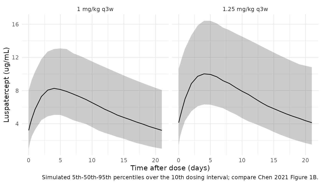
PKNCA validation
ss_start <- (n_dose - 1) * tau
nca_conc <- sim |>
  dplyr::filter(time >= ss_start, !is.na(Cc)) |>
  dplyr::mutate(time_ss = time - ss_start) |>
  dplyr::select(id, time_ss, Cc, treatment)
nca_dose <- cohort |>
  dplyr::transmute(id, time_ss = 0, amt = dose_mg, treatment)

conc_obj <- PKNCA::PKNCAconc(nca_conc, Cc ~ time_ss | treatment + id)
dose_obj <- PKNCA::PKNCAdose(nca_dose, amt ~ time_ss | treatment + id)
intervals <- data.frame(start = 0, end = tau, cmax = TRUE, tmax = TRUE, auclast = TRUE, half.life = TRUE)
nca_res <- PKNCA::pk.nca(PKNCA::PKNCAdata(conc_obj, dose_obj, intervals = intervals))
nca_df <- as.data.frame(nca_res$result)
summary(nca_res)
#>  start end      treatment   N    auclast        cmax              tmax
#>      0  21    1 mg/kg q3w 200 125 [37.2] 8.25 [28.3] 5.00 [3.00, 5.00]
#>      0  21 1.25 mg/kg q3w 200 155 [37.7] 10.2 [29.8] 5.00 [3.00, 5.00]
#>    half.life
#>  12.5 [6.76]
#>  12.7 [6.46]
#>
#> Caption: auclast, cmax: geometric mean and geometric coefficient of variation; tmax: median and range; half.life: arithmetic mean and standard deviation; N: number of subjects
Comparison against published values
Chen 2021 reports a mean elimination half-life of about 11 days, a mean AUCss of 129 ug*day/mL after 1 mg/kg (among the patients of the exposure-hemoglobin analysis), and a 36% coefficient of variation for AUCss (Results).
auc_1 <- nca_df |> dplyr::filter(treatment == "1 mg/kg q3w", PPTESTCD == "auclast")
hl_1 <- nca_df |> dplyr::filter(treatment == "1 mg/kg q3w", PPTESTCD == "half.life")
typical_hl <- log(2) * 8.39 / 0.532
cmp <- tibble::tibble(
  `NCA parameter` = c("AUCss (0-21 d), mean", "AUCss, CV%", "t1/2, mean", "t1/2, typical subject (ln2 V/CL)"),
  Published = c("129 ug*day/mL", "36%", "~11 days", "~11 days"),
  Simulated = c(sprintf("%.0f ug*day/mL", mean(auc_1$PPORRES)),
                sprintf("%.0f%%", 100 * stats::sd(auc_1$PPORRES) / mean(auc_1$PPORRES)),
                sprintf("%.1f days", mean(hl_1$PPORRES, na.rm = TRUE)),
                sprintf("%.1f days", typical_hl))
)
knitr::kable(cmp)| NCA parameter | Published | Simulated |
|---|---|---|
| AUCss (0-21 d), mean | 129 ug*day/mL | 133 ug*day/mL |
| AUCss, CV% | 36% | 37% |
| t1/2, mean | ~11 days | 12.5 days |
| t1/2, typical subject (ln2 V/CL) | ~11 days | 10.9 days |
stopifnot(
  abs(mean(auc_1$PPORRES) / 129 - 1) < 0.15,
  abs(typical_hl - 11) < 0.5,
  abs(stats::median(hl_1$PPORRES, na.rm = TRUE) / 11 - 1) < 0.2
)
The simulated mean AUCss depends on the assumed covariate distributions; the published 129 ug*day/mL refers to the phase 2 subset of the exposure-hemoglobin analysis, so agreement within 15% is the appropriate check rather than an exact match.
Figure 1C – clinical relevance of covariates
Figure 1C compares median exposure at covariate values below the 10th or above the 90th percentile against patients within the 10th-90th percentiles, under weight-based (1.25 mg/kg) and fixed (71 mg) dosing. Because luspatercept PK is linear, AUCss = dose / CL/F exactly, so the comparison can be made deterministically at the percentile thresholds printed on the Figure 1C axis (albumin 42 and 50 g/L; transfusion burden 7 and 20 units/24 weeks; weight 45 and 74 kg), holding the other covariates at their medians.
cl_typ <- function(WT, ALB, RBCT) 0.532 * (WT / 70)^0.806 * (ALB / 46)^-0.881 * exp(-0.0118 * (RBCT - 14))
ref <- list(WT = 57.1, ALB = 46, RBCT = 14.1)
auc_at <- function(WT = ref$WT, ALB = ref$ALB, RBCT = ref$RBCT, fixed = FALSE) {
  dose <- if (fixed) 71 else 1.25 * WT
  dose / cl_typ(WT, ALB, RBCT)
}
fig1c <- tibble::tribble(
  ~Covariate, ~Dosing, ~value, ~auc,
  "Albumin < 42 g/L", "weight-based", 42, auc_at(ALB = 42),
  "Albumin > 50 g/L", "weight-based", 50, auc_at(ALB = 50),
  "RBCT < 7", "weight-based", 7, auc_at(RBCT = 7),
  "RBCT > 20", "weight-based", 20, auc_at(RBCT = 20),
  "Weight < 45 kg", "weight-based", 45, auc_at(WT = 45),
  "Weight > 74 kg", "weight-based", 74, auc_at(WT = 74),
  "Weight < 45 kg", "fixed 71 mg", 45, auc_at(WT = 45, fixed = TRUE),
  "Weight > 74 kg", "fixed 71 mg", 74, auc_at(WT = 74, fixed = TRUE)
) |>
  dplyr::mutate(
    auc_ref = ifelse(Dosing == "fixed 71 mg", auc_at(fixed = TRUE), auc_at()),
    pct_diff = 100 * (auc - auc_ref) / auc_ref
  )
knitr::kable(dplyr::select(fig1c, Covariate, Dosing, pct_diff), digits = 1,
caption = "Typical-subject AUCss difference (%) at the Figure 1C percentile thresholds.")| Covariate | Dosing | pct_diff |
|---|---|---|
| Albumin < 42 g/L | weight-based | -7.7 |
| Albumin > 50 g/L | weight-based | 7.6 |
| RBCT < 7 | weight-based | -8.0 |
| RBCT > 20 | weight-based | 7.2 |
| Weight < 45 kg | weight-based | -4.5 |
| Weight > 74 kg | weight-based | 5.2 |
| Weight < 45 kg | fixed 71 mg | 21.2 |
| Weight > 74 kg | fixed 71 mg | -18.9 |
wb <- fig1c$pct_diff[fig1c$Dosing == "weight-based"]
fx <- fig1c$pct_diff[fig1c$Dosing == "fixed 71 mg"]
stopifnot(
  all(abs(wb) < 20),                                        # Results: < 20% for albumin and RBCT
  all(abs(wb[grepl("Weight", fig1c$Covariate[fig1c$Dosing == "weight-based"])]) < 10),  # < 10% for weight
  all(abs(fx) > 15)                                         # fixed dosing: about 25%
)
The thresholds are the edges of the extreme groups, so the group medians the paper compares lie further out and its percentages (up to about 25% for fixed dosing) are somewhat larger than these threshold values. The ordering – weight-based dosing within 10% for weight, fixed dosing about 20% or more – reproduces.
Exposure-response
Each subject’s exposure metric is the starting-dose AUCss = dose / individual CL/F, taken from the PK simulation above. The 1 mg/kg arm is used because 79.8% of the PK population started at that dose.
indiv <- sim |>
  dplyr::distinct(id, cl) |>
  dplyr::left_join(dplyr::select(cohort, id, dose_mg, treatment), by = "id") |>
  dplyr::mutate(AUC_LUSP = dose_mg / cl)

er_names <- c("Chen_2021_luspatercept_hb_change", "Chen_2021_luspatercept_hb_response",
              "Chen_2021_luspatercept_teae_grade3", "Chen_2021_luspatercept_bone_pain")
er <- lapply(er_names, function(n) rxode2::rxode2(readModelDb(n)))
names(er) <- er_names

predict_er <- function(ui, auc, out) {
  ev <- as.data.frame(rxode2::et(seq_along(auc) - 1))
  ev$AUC_LUSP <- auc
  res <- rxode2::rxSolve(ui, ev, returnType = "data.frame")  # no random effects in these models
  res[[out]]
}
auc_grid <- seq(0, 300, by = 5)
curves <- dplyr::bind_rows(
  tibble::tibble(endpoint = "Hb change, weeks 1-3 (g/dL)", auc = auc_grid,
                 value = predict_er(er[[1]], auc_grid, "d_hb")),
  tibble::tibble(endpoint = "P(Hb increase >= 1 g/dL, day 21)", auc = auc_grid,
                 value = predict_er(er[[2]], auc_grid, "prob_hb_increase_1g")),
  tibble::tibble(endpoint = "P(TEAE grade >= 3, cycles 1-2)", auc = auc_grid,
                 value = predict_er(er[[3]], auc_grid, "prob_teae_grade3")),
  tibble::tibble(endpoint = "P(bone pain, cycles 1-2)", auc = auc_grid,
                 value = predict_er(er[[4]], auc_grid, "prob_bone_pain"))
)
Figure 2A – hemoglobin change over the first cycle
ggplot(fig2a, aes(auc, d_hb)) +
  geom_point(aes(colour = dose)) +
  geom_line(data = dplyr::filter(curves, endpoint == "Hb change, weeks 1-3 (g/dL)", auc <= 215),
            aes(auc, value)) +
  labs(x = "Luspatercept AUCss (ug*day/mL)", y = "Hb change (g/dL/3 weeks)", colour = "mg/kg",
       caption = "Replicates Chen 2021 Figure 2A: digitized points and the packaged regression line.") +
  theme_minimal()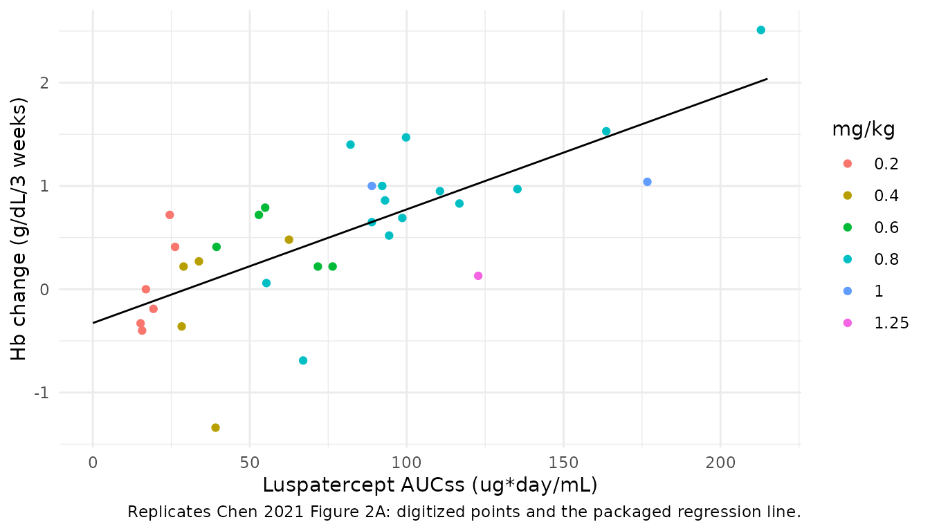
d_hb_129 <- predict_er(er[[1]], 129, "d_hb")
stopifnot(abs(d_hb_129 - 1) < 0.15)  # Results: 'a mean increase of approximately 1 g/dL ... at 1 mg/kg (mean AUCss = 129)'
At the published mean 1 mg/kg exposure of 129 ug*day/mL the model predicts a 1.09 g/dL increase, matching the Results statement of “approximately 1 g/dL”.
Figure 2B – probability of a >= 1 g/dL hemoglobin increase
The observed responder fractions by AUCss quartile (1/18, 4/17, 5/17, 10/18) are compared with the model at each quartile’s plotted position (read from the vector coordinates of the Figure 2B markers).
q2b <- tibble::tibble(
  quartile = paste0("Q", 1:4),
  auc = x2b(c(360.38, 401.85, 419.40, 458.96)),
  observed = c(1 / 18, 4 / 17, 5 / 17, 10 / 18)
) |>
  dplyr::mutate(predicted = predict_er(er[[2]], auc, "prob_hb_increase_1g"))
knitr::kable(q2b, digits = 3)| quartile | auc | observed | predicted |
|---|---|---|---|
| Q1 | 36.596 | 0.056 | 0.067 |
| Q2 | 83.818 | 0.235 | 0.200 |
| Q3 | 103.802 | 0.294 | 0.297 |
| Q4 | 148.849 | 0.556 | 0.581 |
or50 <- exp(50 * er[[2]]$iniDf$est[er[[2]]$iniDf$name == "e_auc_logit"])
stopifnot(
  abs(or50 - 3.73) < 0.01,
  max(abs(q2b$predicted - q2b$observed)) < 0.06
)

ggplot(dplyr::filter(curves, endpoint == "P(Hb increase >= 1 g/dL, day 21)", auc <= 215), aes(auc, value)) +
  geom_line() +
  geom_point(data = q2b, aes(auc, observed), shape = 15) +
  coord_cartesian(ylim = c(0, 1)) +
  labs(x = "Luspatercept AUCss (ug*day/mL)", y = "Probability of response",
       caption = "Replicates Chen 2021 Figure 2B (squares: observed quartile fractions).") +
  theme_minimal()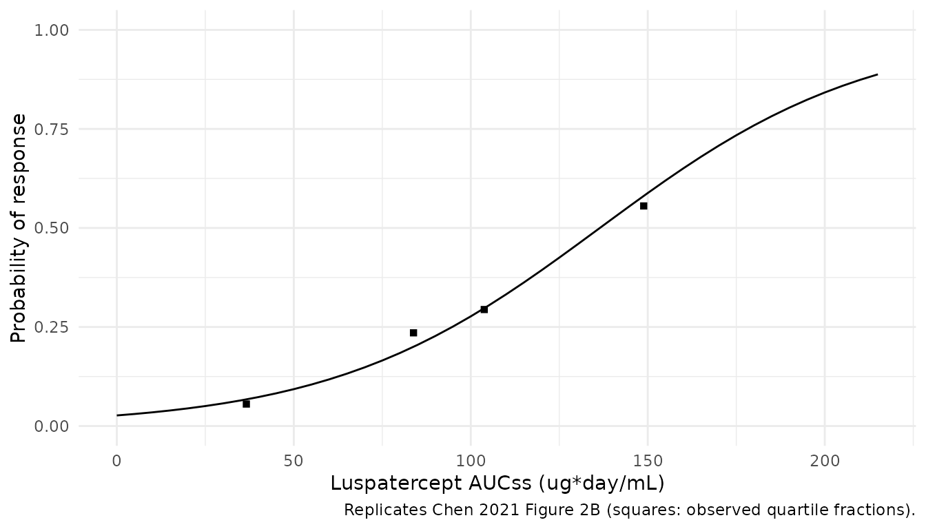
Figures 4A and 4B – adverse events in cycles 1-2
A property of any maximum-likelihood logistic regression with an intercept is that the fitted probabilities sum to the observed number of events. The individual exposures are not published, but the simulated 1 mg/kg cohort gives a comparable exposure distribution, so its mean predicted probability should sit close to the observed overall rate (23/285 for grade >= 3 TEAEs, 55/285 for bone pain).
auc_1mgkg <- indiv$AUC_LUSP[indiv$treatment == "1 mg/kg q3w"]
fig4 <- tibble::tibble(
  Endpoint = c("TEAE grade >= 3", "Bone pain (any grade)"),
  `Observed rate` = c(23 / 285, 55 / 285),
  `Mean predicted` = c(mean(predict_er(er[[3]], auc_1mgkg, "prob_teae_grade3")),
                       mean(predict_er(er[[4]], auc_1mgkg, "prob_bone_pain")))
)
knitr::kable(fig4, digits = 3)| Endpoint | Observed rate | Mean predicted |
|---|---|---|
| TEAE grade >= 3 | 0.081 | 0.084 |
| Bone pain (any grade) | 0.193 | 0.193 |
stopifnot(abs(fig4$`Mean predicted` / fig4$`Observed rate` - 1) < 0.1)

curves |>
  dplyr::filter(grepl("cycles 1-2", endpoint), auc >= 13) |>
  ggplot(aes(auc, value)) +
  geom_line() +
  facet_wrap(~endpoint) +
  coord_cartesian(ylim = c(0, 1)) +
  labs(x = "Luspatercept AUCss (ug*day/mL)", y = "Probability of event",
       caption = "Replicates the fitted lines of Chen 2021 Figures 4A and 4B.") +
  theme_minimal()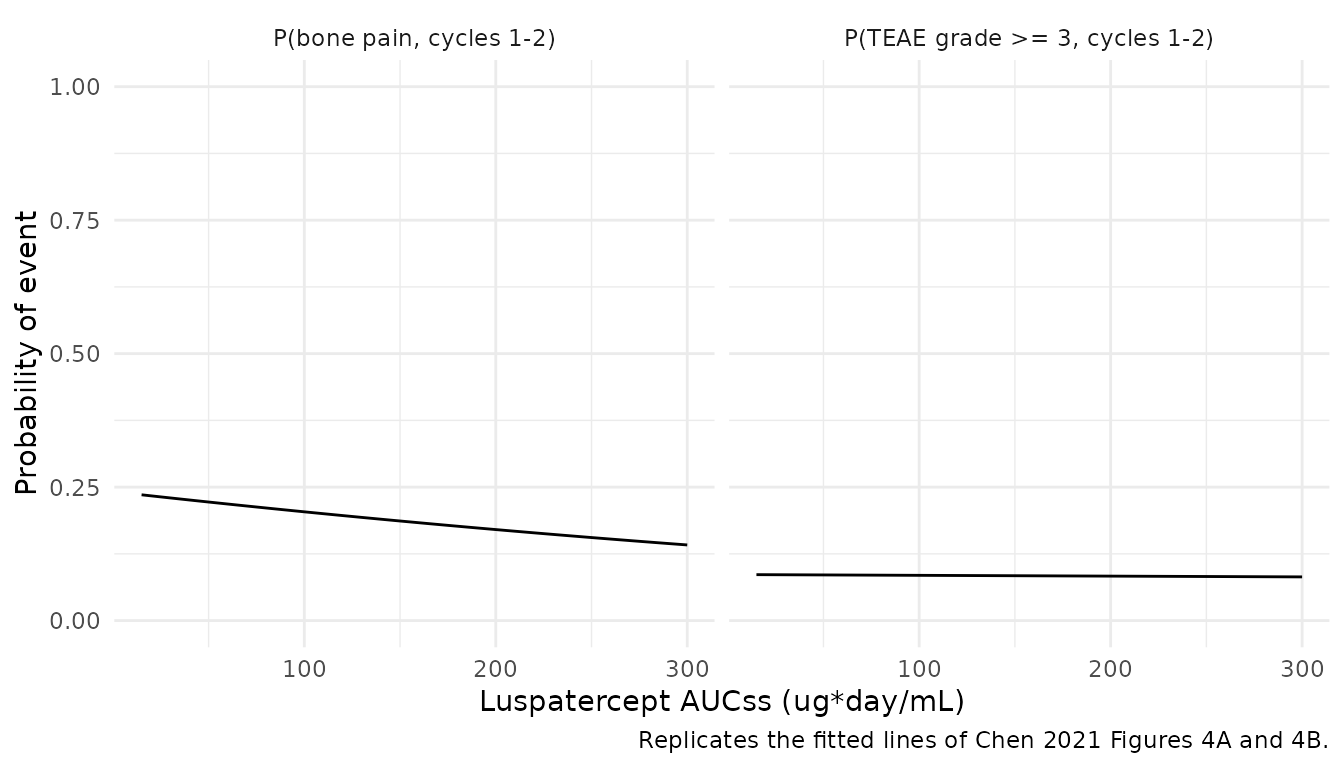
Both adverse-event relationships are flat, as the paper reports: across the plotted exposure range the probability of a grade >= 3 TEAE changes by less than half a percentage point and the probability of bone pain falls slightly with exposure.
Assumptions and deviations
- IIV scale. Table 2 reports IIV as percentages for an exponential model. They are read as sqrt(omega^2) x 100 (omega^2 = 0.1204 for CL/F, 0.0762 for V1/F), the convention of the same group’s Chen 2020 luspatercept analysis. The alternative reading, omega^2 = log(1 + CV^2), would give 0.1135 and 0.0735. The 36% descriptive CV of AUCss is consistent with either, so the choice has little practical effect.
- Residual error. The additive error on log-transformed concentrations is encoded as a proportional error of 20.8% in linear space.
- Covariate centring. The transfusion-burden terms are centred at 14 units/24 weeks exactly as printed in the Results equations (the Table 1 median is 14.1).
- Figure-derived exposure-response coefficients. Chen 2021 prints only one coefficient of the Figure 2A and 2B regressions (the slope and the odds ratio) and no coefficients for Figures 4A and 4B. The missing coefficients were read from the vector coordinates of the fitted lines, as shown above. Where a slope is printed, the printed value is used and the intercept is chosen so the line passes through the drawn line’s midpoint (Figure 2A) or middle curve node (Figure 2B). The residual SD of the Figure 2A regression is not printed; 0.511 g/dL is the residual standard error of an OLS refit to the digitized points.
- Placeholder residuals. The three logistic models carry a fixed 0.001 additive residual on the probability so that rxode2 has an error model to attach. The source likelihood is Bernoulli and has no residual error.
- Extrapolated intercepts. Placebo patients were shown in Figures 2 and 4 for comparison but excluded from the regressions, so every intercept is an extrapolation to zero exposure rather than a placebo-arm estimate.
- Analyses not packaged. The multivariable logistic models for the phase 3 transfusion-reduction endpoints (Table 3) do not report intercepts, and their exposure terms are not significant. The univariate adverse-event logistic models over the whole study (Supplemental Table S3) also omit the intercepts. The Cox models (Table 4) omit the baseline hazard. The dose-escalation-stratified curves of Figure 2D are a diagnostic for selection bias; the paper pools the strata and reports the pooled endpoint in Table 3. None of these can be simulated from the published information.
- Virtual cohort. Covariate distributions are assumed (log-normal weight, normal albumin and transfusion burden) and matched to the Table 1 medians and ranges; the individual data are not available.
- Errata. No erratum or correction for Chen 2021 was found in a EuropePMC search on 2026-09-27.